Great Places Housing Group is a not-for-profit housing association based in Manchester, operating across the North West, South Yorkshire and Derbyshire. With a portfolio of over 25,000 homes, they provide affordable housing and support services to help build thriving, sustainable communities. Their work spans everything from social rent and shared ownership to regeneration, employment support and environmental projects — all driven by a clear, purpose-led mission.
THE CHALLENGE
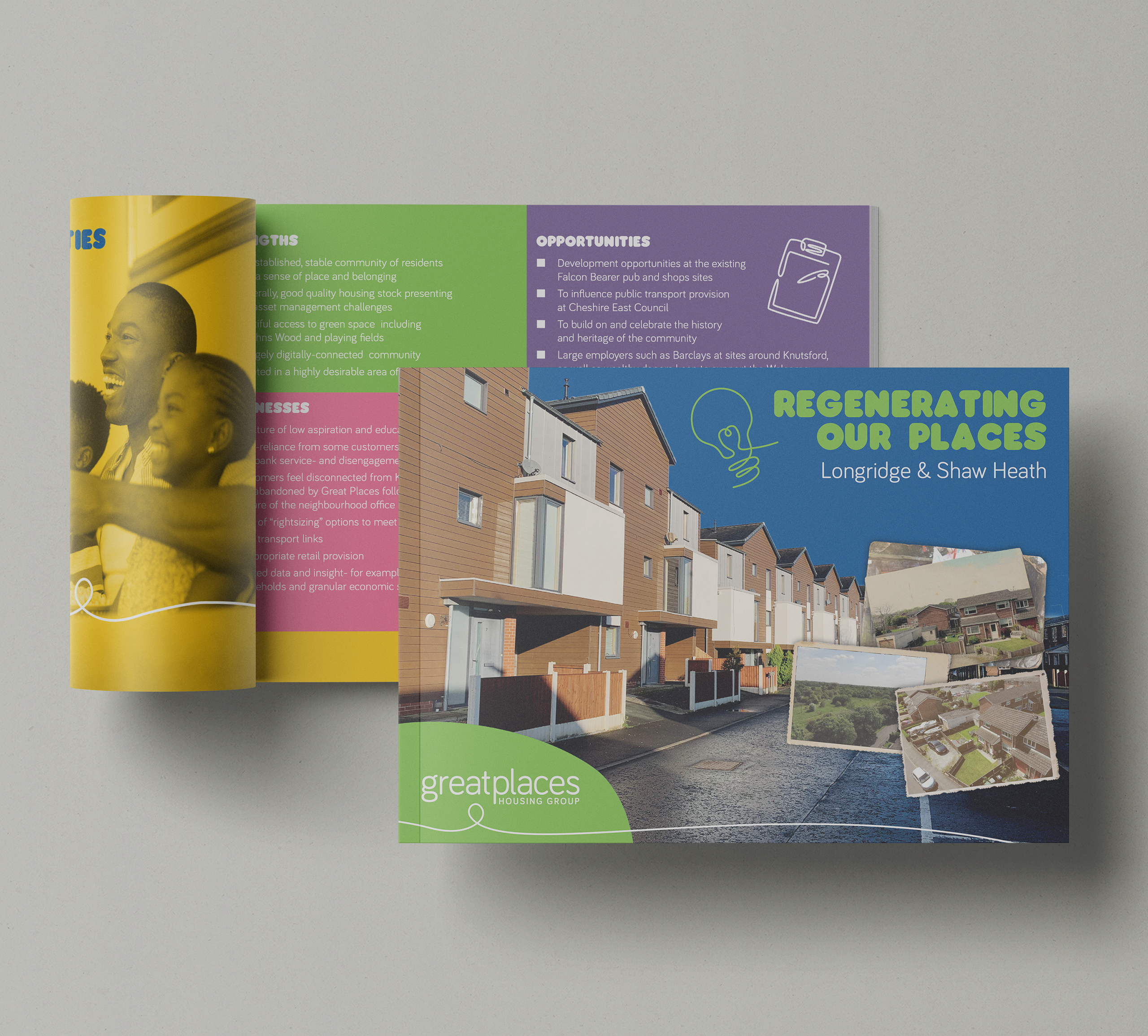
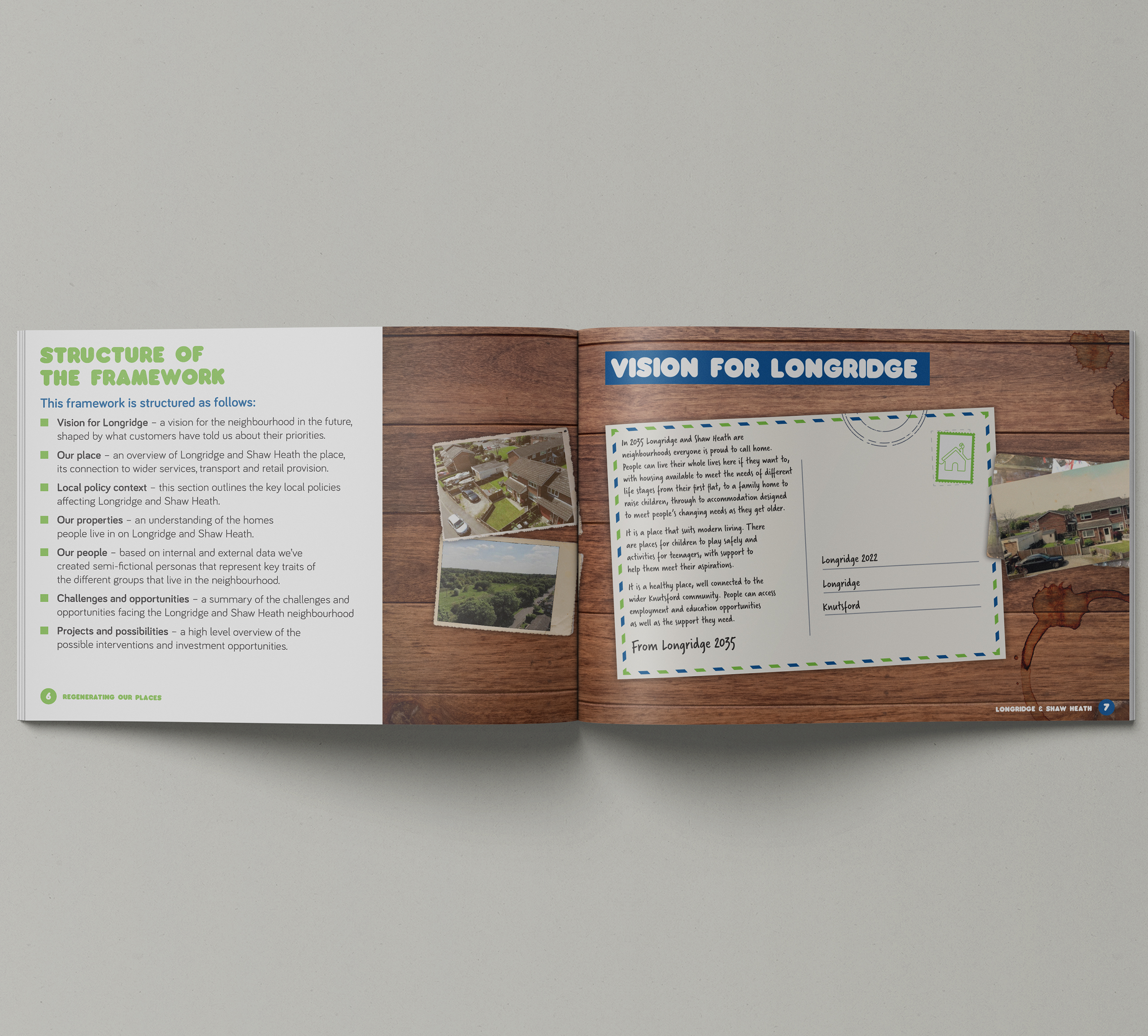
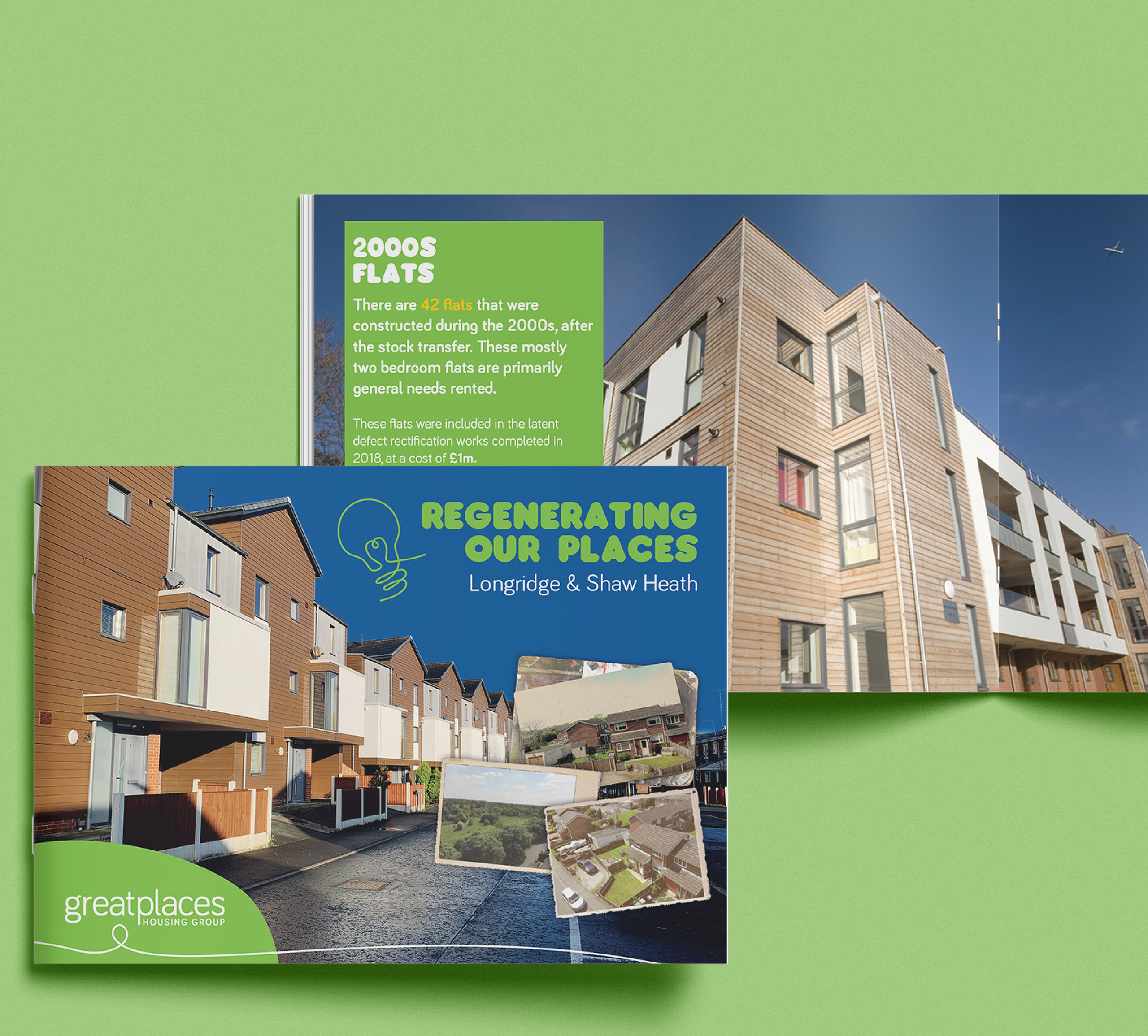
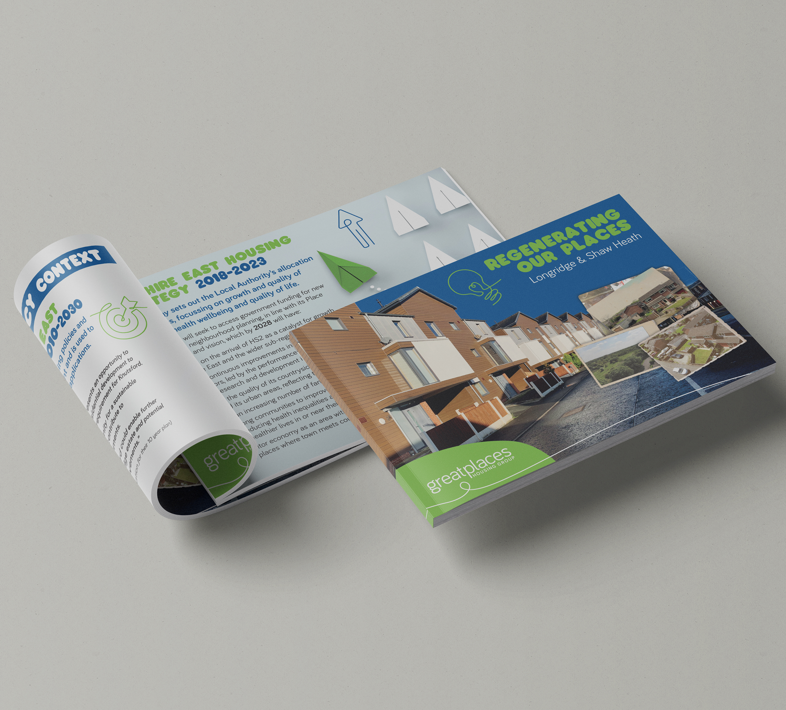
Great Places approached me to design a visually engaging printed report to support their regeneration strategy for Longridge and Shaw Heath — two neighbouring estates with a complex social landscape.
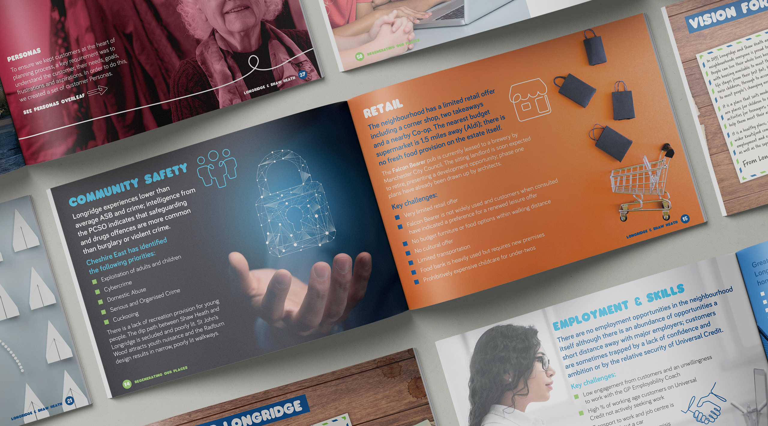
The report needed to distil extensive research, policy context and community insight into a format that was clear, accessible and impactful. The estates face a combination of challenges: limited transport links, high financial hardship, low educational attainment, and a sense of disconnect from nearby Knutsford. The closure of local services and the ongoing cost of living crisis had contributed to a growing sense of isolation and stagnation.
Great Places wanted the report to help make a compelling case for future investment, so it needed to reflect on-the-ground realities while presenting a hopeful and credible vision for change. The brief called for clarity and professionalism — but also warmth. This was about people and place, not just policy.
THE APPROACH
To bring the content to life, I developed a clear, spacious layout design that gave equal weight to both data and narrative. I sourced and licensed relevant stock photography, applying colour overlays to unify the imagery and maintain consistency with Great Places’ visual identity.
To support navigation and break up dense content, I created a suite of custom icons in a continuous-line style — designed to complement the existing brand language. These added personality while guiding the reader through complex topics without overwhelming them.
The focus throughout was on balance: pairing warmth and humanity with a credible, stakeholder-ready design.
THE SOLUTION
The finished brochure was a 70-page A5 landscape report, printed and PUR-bound for a clean, professional finish. I advised on the format and orientation early to ensure it felt approachable, easy to handle and well-suited to the content.
The design struck a careful balance between accessibility and authority — clear enough to support community discussions, polished enough to present to funders and decision-makers. Full-bleed photography added weight and warmth, while custom icons and colour overlays helped clarify topics such as housing, education and employment.
I also managed the print production directly, supplying 50 high-quality copies on 350gsm silk covers with 170gsm silk inners — delivered on time and ready for immediate use.
As a team we sat down with Nige and talked over our ideas and goals and he really listened and came up with the whole concept, brand, colour schemes and produced a whole detailed brand guidelines… to remind us of the way to present ourselves across multiple platforms.
Paul Phipps-Williams Photography
★★★★★
It was not an easy brief, but Nige cracked it. I was presented with Brand Guidelines which have become my bible… ensuring a clean and consistent approach and giving me a strong bedrock for the future.
Gerry Mitchell
★★★★★
Founder & Director
Nige was with me, collaborating on the process from day one…I felt like he bought into my ideas, and really used his expertise to produce something of real value to me!
Odette Green Photography
★★★★★
Thank you so much I bloody love this!! I've had a good read through and love it all, nothing to change at all. It's all so me 🥰
Phillip Izzard
★★★★★
Founder & Director, Online Probate
I must say the final concept is stunning and has completely exceeded our expectations! The whole process was seamless and very professional…would highly recommend.
Julie Robinson
★★★★★
Founder, Time to Connect
Really professional, efficient, creative. Listened to what we wanted and delivered the branding exactly as we envisaged it.